Overview
Teaching: 20 min Exercises: minQuestions
What is
cartopy? How can it help with visualization?How do I create a simple map in Python?
Objectives
Set up a basemap using
cartopyChange projections on basemap.
Understand interface between standard
matplotlibplotting andcartopy.
Notebook
This tutorial is accompanied by a Jupyter notebook, which can be found here.
Why Cartopy?
The Python package ecosystem is robust, which means that usually there are several packages which all attempt to satisfy the same need. The landscape of mapping packages is no different. We’ve chosen cartopy for two reasons: 1) the authors of this tutorial and our scientific communities have made extensive use of cartopy and have found that it does its job well and comprehensively, and 2) it’s engineered for scientists and maintained by an active development community.
Cartopy 101
For our purposes here, cartopy is a python package which provides a set of tools for creating projection-aware geospatial plots using python’s standard plotting package, matplotlib. Cartopy also has a robust set of tools for defining projections and reprojecting data, which are used under-the-hood in our tutorial, but won’t be covered in depth here.
The bottom line is that Cartopy provides a very easy, cartographically accurate method for producing maps, and pairs well with other Python tools like geopandas.
Building Blocks
Cartopy has several fundamentals which are useful to conceptualize, outlined below.
1) Projections (cartopy.crs)
A central utility of the cartopy package is the ability to define, and transform data among, cartographic projections. The cartopy.crs module (CRS = coordinate reference system a.k.a. projection) defines a set of projections which are useful in defining the desired projection of a plot. These projections augment the machinery of matplotlib to allow for geospatial plots.
2) Features (cartopy.feature)
Cartopy also contains a module for accessing geospatial data files, like shapefiles or GeoJSON. It has a convenient set of data loaders for adding context to maps (like coastlines, borders, place names, etc.). We’ll use this module in the example below.
Making a Map
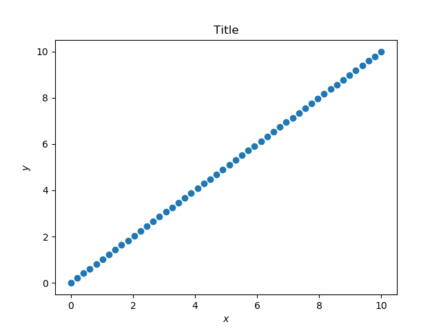
Typically, when creating a new plot in matplotlib, we employ a set of commands like so:
ax = plt.axes()           # create a set of axes
ax.scatter(x, y, ax=ax)   # plot some data on them
ax.set_title("Title")     # label it
ax.set_xlabel("$x$")
ax.set_ylabel("$y$")
plt.show()
This creates a plot somewhat akin to this:
|
Spatial data is unique because plots containing it (i.e., maps) have specialized axes. Think about it: looking at your favorite projection, the gridlines aren’t necessarily straight, nor are they evenly-spaced, like they would be if we drew lines onto the plot above.
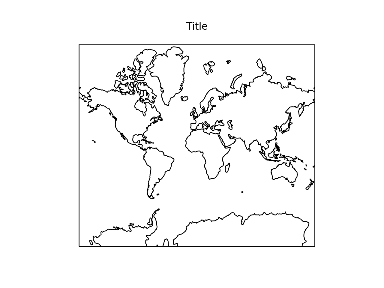
For this reason, we employ cartopy to define the mapping between our data and our visualization. Here’s how: the plt.axes() function takes a projection = argument. Knowing this, we only need to change two lines of our above code as follows:
import cartopy.crs as ccrs                   # import projections
import cartopy.feature as cf                 # import features
ax = plt.axes(projection = ccrs.Mercator())  # create a set of axes with Mercator projection
ax.add_feature(cf.COASTLINE)                 # plot some data on them
ax.set_title("Title")                        # label it
plt.show()
This creates a plot as follows;
|
Simple! To change the projection of the data, all we need to do is modify that first line.
ax = plt.axes(projection = ccrs.LambertConformal())
ax.add_feature(cf.COASTLINE)
ax.set_title("Title")
plt.show()
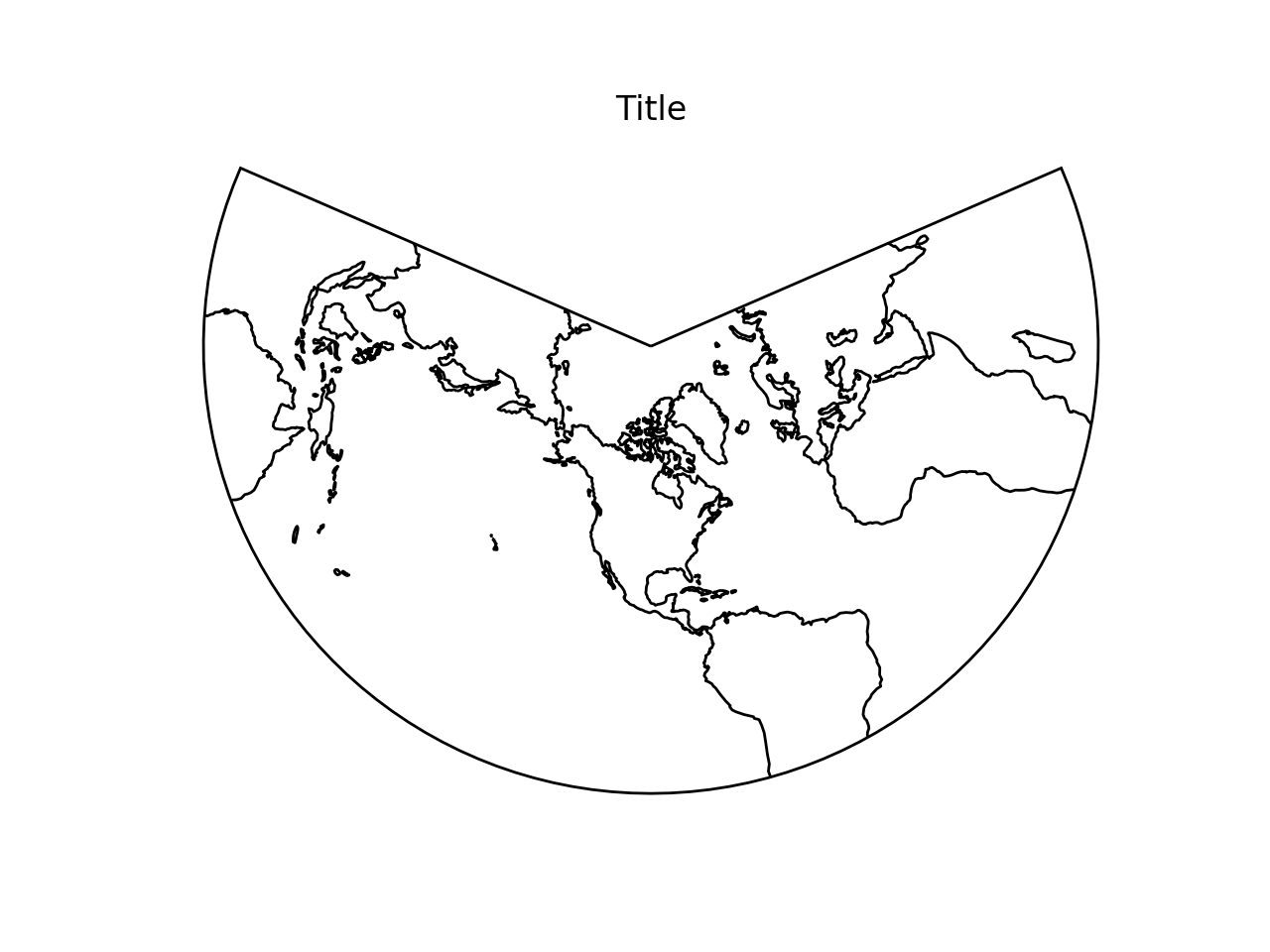
|
A Local Example
Let’s compare projections around Seattle. As with many places, there are local specific projections which are commonly used in a particular area of interest. Those, around here, are Washington North (EPSG:2926) and Washington South (EPSG:2927)
Let’s define some helpful constants:
WASHINGTON_NORTH = 2926
WASHINGTON_SOUTH = 2927
SEATTLE_BOUNDS = [-122.4596959,-122.2244331,47.4919119,47.734145]
WASHINGTON_BOUNDS = [-124.849,-116.9156,45.5435,49.0024]
SEATTLE_CENTER = (-122.3321, 47.6062)
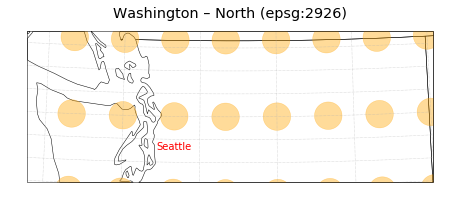
Here’s the first projection:
fig = plt.figure(figsize=(8, 8))
ax = plt.axes(projection=ccrs.epsg(WASHINGTON_NORTH))
#ax.set_extent(<NO EXTENT>) # not setting bounds means we can see the full extent of the projected space.
ax.set_title("Washington – North (epsg:2926)")
ax.add_feature(states_feature)
ax.annotate('Seattle', xy=SEATTLE_CENTER, xycoords=ccrs.PlateCarree()._as_mpl_transform(ax), color='red',
            ha='left', va='center')
ax.gridlines(linestyle=":")
ax.tissot(lats=range(43, 51), lons=range(-124, -116), alpha=0.4, rad_km=20000, color='orange')
plt.show()
|
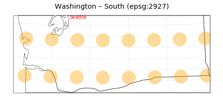
Second:
fig = plt.figure(figsize=(8, 8))
ax = plt.axes(projection=ccrs.epsg(WASHINGTON_SOUTH))
#ax.set_extent(<NO EXTENT>) # not setting bounds means we can see the full extent of the projected space.
ax.set_title("Washington – North (epsg:2926)")
ax.add_feature(states_feature)
ax.annotate('Seattle', xy=SEATTLE_CENTER, xycoords=ccrs.PlateCarree()._as_mpl_transform(ax), color='red',
            ha='left', va='center')
ax.gridlines(linestyle=":")
ax.tissot(lats=range(43, 51), lons=range(-124, -116), alpha=0.4, rad_km=20000, color='orange')
plt.show()
|
What’s the difference? There’s really only one. Check out line 2. We changed WASHINGTON_NORTH to WASHINGTON_SOUTH. Those are variables containing the EPSG codes as defined above. That’s all we needed to change the projection.
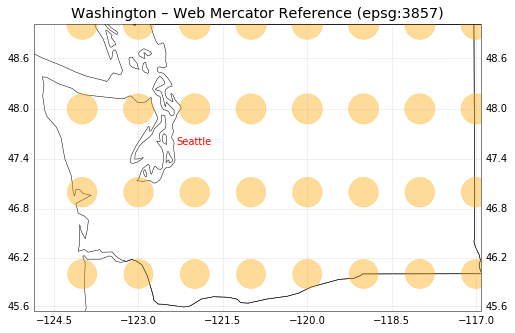
For comparison, let’s look at the Mercator projection:
fig = plt.figure(figsize=(8, 8))
ax = plt.axes(projection=_DEFAULT_PROJECTION)
ax.set_extent(WASHINGTON_BOUNDS) # not setting bounds means we can see the full extent of the projected space.
ax.set_title("Washington – Web Mercator Reference (epsg:3857)")
ax.annotate('Seattle', xy=SEATTLE_CENTER, xycoords=ccrs.PlateCarree()._as_mpl_transform(ax), color='red',
            ha='left', va='center')
ax.add_feature(states_feature)
gl = ax.gridlines(linestyle=":", draw_labels=True)
ax.tissot(lats=range(43, 51), lons=range(-124, -116), alpha=0.4, rad_km=20000, color='orange')
|
Notice: we’ve left off the ax.set_extent function for the plots of the Washington-specific projections. This tells Cartopy to perform its default behavior, which is to plot the entire extent of the projected space.
You can see that each projection is for a small portion of the planet (northern and southern Washington, respectively). This illustrates an important point about projections: most of them are defined for a specific, discrete region, and therefore one should choose their projection carefully. cartopy will throw an error if you attempt to plot a geometry in a projection which it cannot project that geometry into! (try it).
Since the majority of projections baked in to cartopy are for the entire earth, you don’t have to worry about that very much. However, some projections are better-suited to displaying small slices of the planet rather than the whole thing at once. These cartographic details will be better covered elsewhere.
Key Points
Cartopy can easily manage projections.
A few simple modifications to
matplotlibcode (namely theprojectionkeyword) can turn any matplotlib plot into a spatially-aware one.